Wednesday, April 28, 2010

Ver 2 - Regional spatial variation.

The last thing I wanted to get working in TempLS before posting was mapping regional spatial variation. But that's been more difficult than I expected. It comes hard up against resolution and the irregular distribution of stations. But these turn up in somewhat unexpected ways. It's been instructive, so I thought I could blog about that while I'm thinking about what to do next.

My idea was to look at roughly rectangular regions in a similar way to the example of the globe with spherical harmonics. A more appropriate family of functions there are trig functions - a standard Fourier series in 2D, although fitted by least squares.

I looked at ConUS, where NOAA has plots that I can compare with. The results were not disastrous, but not very good. The basic reason is that the number of US stations in ConUS (especially currently) is much smaller than the number NOAA would use.

I could use a larger set, eg USHCN. But I'm looking for a general purpose tool based on GHCN that will work for other places that don't have this alternative. I'll describe progress below the jump.


Orthogonal Functions


First a digression on orthogonal functions - why we like them, and what if we can't get them. As I've said in previous posts, LS spatial representation comes down to saying that the temp or trend is a linear combination of some smooth functions (maybe a hundred or two). After eliminating the variables associated with local station properties, a symmetric matrix equation results

S*p=r

where p are the parameters or coefficients.

Orthogonal functions are chosen to try to ensure that S is well-conditioned. That means that there isn't a large range of eigenvalues. Put another way, there aren't eigenvalues that are very small, which would make the matrix close to singular.

Small eigenvalues hurt, because they represent combinations of approximating functions that can be added with little effect on the result. In our context, without much affecting the sum of squares. But they affect the appearance of the solution. The result is the solution isn't uniquely defined. You can try to compare two outcomes and get what looks like different results. But, even worse, the differences can't be said to have physical significance.

Orthogonal functions like spherical harmonics are actually orthogonal with respect to integration over the region. We don't have that - there are sums representing results at an irregular set of measuring points (the stations). One can hope that these would approximate the effect of integration, but this will fail when the functions have enough variation that they change a lot between stations. That's the resolution issue. What I've been finding is that this happens earlier than I had expected. I think this relates to the irregular distribution.

ConUS


I took an an example problem the task of plotting temperature anomalies for the lower 48 states for 2008. Here's NOAA's version of this result:
.

Using TempLS' mask facility, I chose stations by the US country code, 425, with some lat/lon restrictions to exclude Alaska and Hawaii:

"ConUS" = tv$country == 425 & tv$lat<51 & tv$lon > -130 & endyr > 2007,

Then I defined the minimal lat/lon "rectangle" containing these stations. The Fourier approximants were trig functions periodic on this rectangle, down to a certain minimum wavelength. I used a parameter N which approximately expressed the maximum number of wave periods allowed. I say approximately, because there were more in the horizontal than the vertical.

I originally allowed all ConUS stations, which gave reasonable numbers (1841). But then I added the restriction to stations posting results in 2008, which brought the number of stations down to 122. That's still fine for a countrywide average, but not much for resolving spatial variation.

Low resolution


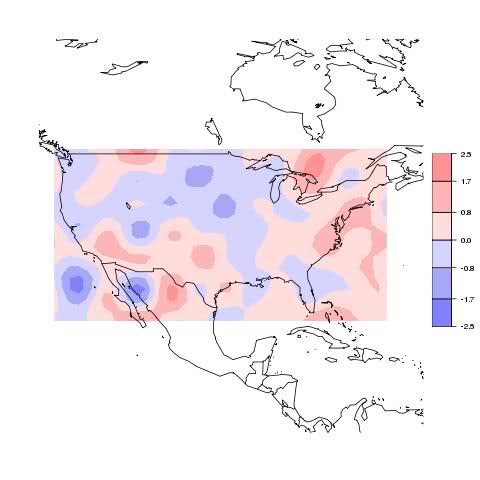
I started with N=2 - trig functions which at their highest frequency only have about 2 periods across the country. The result looked like this:


No detail, although it broadly gets the warm and cold parts right. There were 15 approximating functions. On a Fourier basis, you'd expect the eigenvalues of S to drop by a factor of 4 as the frequency rises, but a plot actually shows:

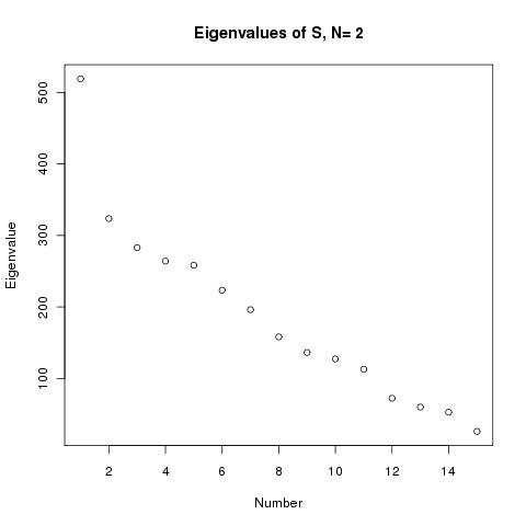
The drop is by a factor of 20 - not enough for major artefacts, but a problem looming.

More resolution


So try N=4. Now 35 approximating functions. The eigenvalue plot now looks like this:


The minimum eigenvalue is now 1.4, down by a factor of about 400. So there may be problems. Here's the plot:

It actually looks better within the country. Same effects but better resolution. But there is a suspicious blob in the Bermuda triangle, and over Canada.

Is this a problem? The likely reason we see trouble there is that, of course, there are no stations used there. The Bahamas blob affects Florida a little, but not much.

One remedy might be to include offshore stations too, including ocean. That would probably do better, but isn't in line with the original aim, which was to get just US results.

Still more resolution


Move on to N=8. Now we have 91 approximating functions. The eigenvalue plot looks like this:

Now the eigenvalues get down to order 10E-5, from a max of 622. That's definitely problem territory, and there are about 20 in that region. Here's the plot:

It's really gone haywire.

PCA


We can try a principle components type remedy. R makes it easy to just get the matrix of eigenvalues corresponding to a larger subset of eigenvalues, and that gives a subset of approximating functions with better orthogonality. Trying that with N=8, allowing a 100:1 range, we're down to 68 functions, and the plot becomes:

So it's at least back within range, and in fact broadly gets the pattern right. It's arguably better than the N=4 result. With a more severe 20:1 eigenvalue restriction, we're down to 59 functions, and the result is:

Similar pattern, but with smaller variations, as you expect with reduced resolution, but may reflect removal of artefacts too.

Beyond the borders


I tried the idea of using all the stations in a rectangular block that included ConUS. The mask was
 "US" = tv$lat<49 & tv$lat>25 & tv$lon< -66 & tv$lon >-125 & tv$endyr>2007,
There are now 171 stations, up from 122. We still have N=8, with 91 approximating functions. There was some good news with the eigenvalue plot:

They taper down to a minimum of 0.7, about 1000 times down from the max, but it's a lot better. Restricting to the 100:1 range only cuts out 6 stations functions, and gives this plot.

Some rather odd spots below Calif, but otherwise reasonable, and the US comparison is probably the best we have seen.

Conclusions and thoughts


To emphasise again, we're trying to get a picture of an area like ConUS with only 122 stations in 2008. With USHCN we could have many more and could do much better. But that idea would not extend to ROW.

The limited resolution plots are of some value, especially if you ignore patterns outside the region with stations.

Ver 2 may push for use of "rectangular" subregions, rather than country-shape regions, to avoid misinterpretation of artefacts. I would probably make a PCA type restriction to a 100:1 eigenvalue range the default.

A more radical idea, which I'll explore, is to move away from smooth approximators like trig functions, which get their orthogonality from phase relations, toward finite element type shape functions. These are approximately orthogonal because most of them just don't overlap, which may be more robust toward station distribution. The resulting plots would be more grid-like.


Monday, April 26, 2010

Spatial Temperature distributions in TempLS v2

This is another trailer for v 2. It can fit temperatures for individual years, and I expect even months, though I haven't tried that yet. The model is that data depends on local effects as before, plus just the temperature of the specified year, over space. Of course that doesn't make a good predictor overall, but the aim is just to get the temp distribution for that year that gives the best fit.

A technical snag which I'm still working on is that this model does not generate the info needed to adjust to a base period. It may be necessary to add that as another fitting parameter. However, since I'm currently comparing to GISS, I just add an offset to match the GISS average anomaly for the relevant year.

I've compared these with the GISS plots. I've also gone back to match the trands of the previous post with the GISS trends for the same period, since GISS produces better maps. BY request, I've also plotted the trend for the period 1900-1945 and compared with GISS. All below the jump.

The last big task remaining for V2 is a mechanism for doing all this regionally, where spherical harmonics would be inefficient.


GISS comparisons

GISS is of course using somewhat different underlying data - all mine are based on GHCN raw and HADSST2. GISS adds other data, particularly Antarctic, and uses a different HAD SST set to 1981, and an OI set beyond. GISS has recently posted a new explanatory paper.

As I mentioned above, the program now does individual years, so I'll show here 2009 and 2008. Because of lacking GHCN data, I've rubbed out above 80N and below 65S. I've more scientifically matched the GISS colors and levels (some GIMP magic).

Here's 2009:
And 2008

Trends

Again, remember that GISS is using somewhat different underlying data. Part of the usefulness of TempLS is that it enables you to try the effects of different data. Remember too that the match of colors and levels is still not exact. Despite what the titles say, my output is not here in C/decade. I've rescaled to match what GISS do. They calculate the expected temperature difference over the time period due to the trend. They call it just a temperature difference, but that is what they mean. So I've multiplied the trend by the elapsed time (in decades). So, 1901-2005:
and 1979-2005
and finally, 1901-1945

Sunday, April 25, 2010

Plotting spatial trends in TempLS

This is a preview of Ver 2. It is a substantial extension, because it takes the principle of least squares fitting further, fitting spatial approximations to global patterns. Whereas before the spatial variation was attributed to local effects (station latitude, altitude etc), now the global model can be allowed spatial properties.

To do this, it is necessary to have a space of approximating functions. I'm using spherical harmonics - typically up to 200. So far I've analysed a model in which the global temperature is assumed to consists of a linear trend, spatially varying. But it will be possible to do yearly or monthly plots and, I think, trends and spatial averages for sub-regions, subject to enough data being available. I'd be interested in suggestions and comments, which is my excuse for posting at this fairly early stage.

Below the jump, I'll compare trends over the Earth's surface with plots from the AR4.


These plots used a total of 140 spherical harmonics, which gave reasonable resolution. The calculation is still quite fast, about 100 sec, so a lot more could be used. It is a whole sphere calculation - I've not plotted at the Arctic and Antarctic extremes, because the results then become extrapolations.

First, here are the plots of global trends from the AR4. It's Fig 3.9 from Sec 3.2.2.7.
and the caption says:  
Figure 3.9. Linear trend of annual temperatures for 1901 to 2005 (left; °C per century) and 1979 to 2005 (right; °C per decade). Areas in grey have insufficient data to produce reliable trends. The minimum number of years needed to calculate a trend value is 66 years for 1901 to 2005 and 18 years for 1979 to 2005. An annual value is available if there are 10 valid monthly temperature anomaly values. The data set used was produced by NCDC from Smith and Reynolds (2005). Trends significant at the 5% level are indicated by white + marks. 

The least squares method doesn't have those minimum requirements, although of course reliability diminishes when the data is sparse. Here are the TempLS plots for the global land/ocean fit:
I've tried to match the levels and colours, but it's obviously not perfect. The TempLS plots pick up the main features well, with an occasional extra flourish which may be real, since it can get information out of sparser data. One exercise will be to resolve this question.

Tuesday, April 20, 2010

An update on global land/sea reconstructions

Zeke also now has a reconstruction using HadSST2, and has posted a thorough comparison of his, mine, and the major indices.

My earlier post had a small error. The dates were out by a year, so my plots lagged by a year, but were also shifted a little vertically because of the changed base for normalisation. The differences aren't obvious, but I've plotted the global V1.4 versions below, mainly to show the new metadata plots.


My SST vs HadSST2
Global Land/Ocean vs GISS and HadCRUT3

Monday, April 19, 2010

The "Bolivia effect"


Trying out V1.4 of TempLS, I looked into the Bolivia effect.
This dwells on the fact that Bolivia hasn't reported any temperatures to GHCN for about 20 years, which is supposed to be a gap in our knowledge. It has had a run at WUWT, and I noticed that it popped up on Google as a suggested search, so someone thinks it is important.


So is it really true that Bolivia creates a big gap? Well, it's true that interior S America is one of the poorly covered regions of the non-Arctic world, so info from there would be useful. But let's look at the maps of V1.4.

Update 15 July - there is a new post which looks at data from the GSOD data base. This has about 30 stations reporting from 1990 to present. GHCN seems to do quite well when compared with this better coverage.


Bolivia


The coords of La Paz are about (-16, -68). So let's see what is within a 1200 km radius. The V1.4 criterion to insert is:

  "Boliv" = getdist(-16,-68)<1200 & isLand, # coords of La Paz

Here's what the analysis reports:


This shows stations that have reported at any time since 1900, and there are lots of stations in Bolivia. However, there is a big drop-off in the 90's and indeed, although this doesn't show it, there were none from Bolivia.


The temperatures themeselves don't show a great trend. The early 20C years look quite warm, but based on very few stations.


So let's see a map of more recently reporting stations. That can be retrieved with this selection:

  "Boliv2" = getdist(-16,-68)<1200 & isLand & tv$endyr>2008,


That filters out stations that haven't reported in 2009-10:


OK, so no drop-off in numbers now (as exoected). The plot since 1901, affected early by small numbers, is broadly similar, and the plot since 1979, with many more stations, is quite similar. The trend since 1979 goes up from 0.08 to 0.12 C/dec.


But there was an objection that the high Andes in Bolivia shouldn't be approximated with humid lowland and coastal areas. OK, let's put in an altitude filter instead, for stations>400m:

   "Boliv1" = getdist(-16,-68)<1200 & isLand & tv$alt>400,


The restriction to recent reporting has gone, so the numbers drop in late years. The temps, though are very similar to the earlier all-altitude figures. And the post-1979 trend is almost the same, at 0.08 C/dec.


So let's look at recent stations, and this time take advantage of another field in the temperature.inv file, called "loc". It characterises stations within 30 km of the coast as "CO". So filtering those with:


  "Boliv3" = getdist(-16,-68)<1200 & isLand & tv$endyr>2008 & tv$loc!="CO",


So station numbers are now getting a bit sparse, though not the total absence that the "Bolivia effect" suggests. The region still has lots of info. And the temperature plot since 1901 is still fairly similar, although there is now a jump at about 1992 which boosts the post-1979 trend to 0.24 C/dec.

The point of this post is really to show the kinds of investigation that can be done. But as far as the Bolivia effect goes - well, if you look calmly to see what is there, it isn't ideal, but it's far from disastrous. The imperfections relate much more to the lack of numbers before 1940. Climate scientists can't change that - they have to work with what we've got.